Hickory Mittens: Choosing Colors
It’s easy to grab a bunch of yarn with colors that sing to you, but when you’re doing colorwork, particularly colorwork with fine lines, small stitches, or many colors, knowing the value (relative lightness or darkness of a color) is important, too.
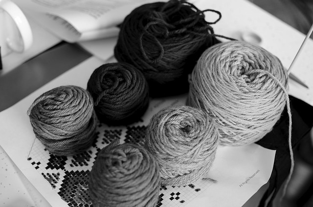
Taking a black and white photo is a great way of finding out the values of the yarns you’re thinking of using. The person who chose the yarns below is good to go. She’ll be able to create a wide variety of color combinations in her mittens that will contrast both in color, which she can tell by eye, and value, which is seen in this photo. I think this photo trick is great because you might be surprised by what colors have really similar values.
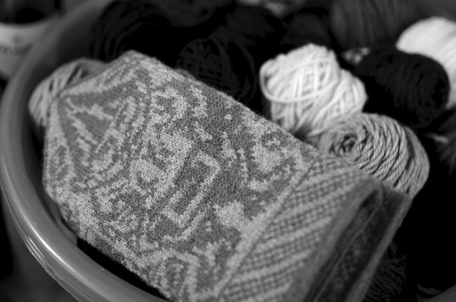
The reason you can see a gnome in this mitten, with its million sts. per inch, is because Cheryl used colors with different values. See?
For the Hickory Mittens, I definitely like a lot of contrast between the values of the main color and the second main color (the motif outliner). As for the contrast colors, there are some different, wonderful, options.
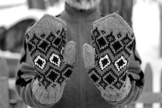
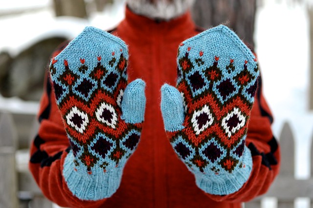
You can see that in this pair, that there is a darker value outlining each motif, and separating medium value colors from each other:
Would you ever guess that the blue, gold, and orange were so similar in value?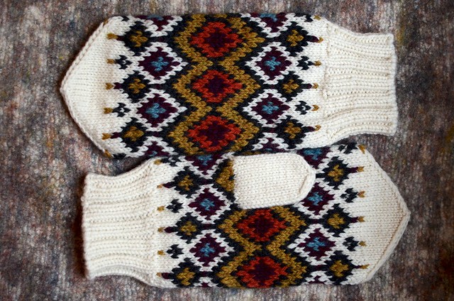
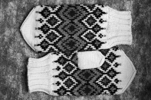
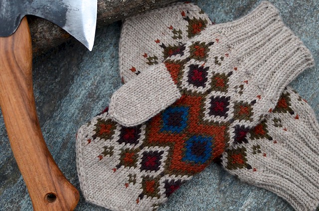
In this pair, there are two with dark values (charcoal and maroon) chumming it up in the diamonds, but note that the outlining color stands out against the background, and check out that cream:
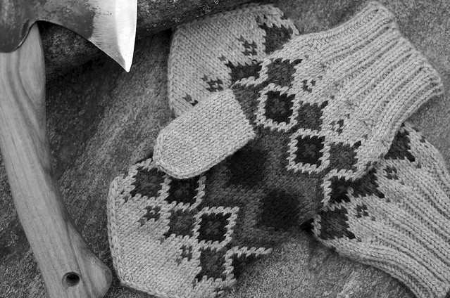
In David’s pair, there are similar values right at the center. It creates almost an optical illusion of depth at the center of the mittens:
I think they’re all great combinations. Take note that there are differences in values in each pair, just that you don’t need to have a certain number of each to make awesome mittens.
I know that people at Mitten School had iPhone apps that took b&w photos, but I can’t remember the names. The new Flickr app has a filter that works well. Very handy for in-store comparisons. For these photos, I turned my DSLR to B&W and just looked at the screen. Works a treat!
3 Responses to “Hickory Mittens: Choosing Colors”
I love these mittens, and thank you for your post about color values. Even after years of card making and working with a color wheel, I seem to have a problem with color tones and values for some reason. The Hickory mittens are so much fun – beautiful!
Once again your post are so informative. I would have never thought to do this and it just makes such sense! Thanks again for all the great info and of course another wonderful pattern. Can not wait to gather and knit!
Seeing the colors after the black and white pictures is incredible! I never thought to look at colors like this